Wedding Suite Design
As the resident graphic artist in several of my friend groups, I’ve had the honor of being asked to create invitation suites for several of my friends weddings. Its such a special thing to be a part of, and fun to work with each couples unique requests!
Taylor & Jonathan
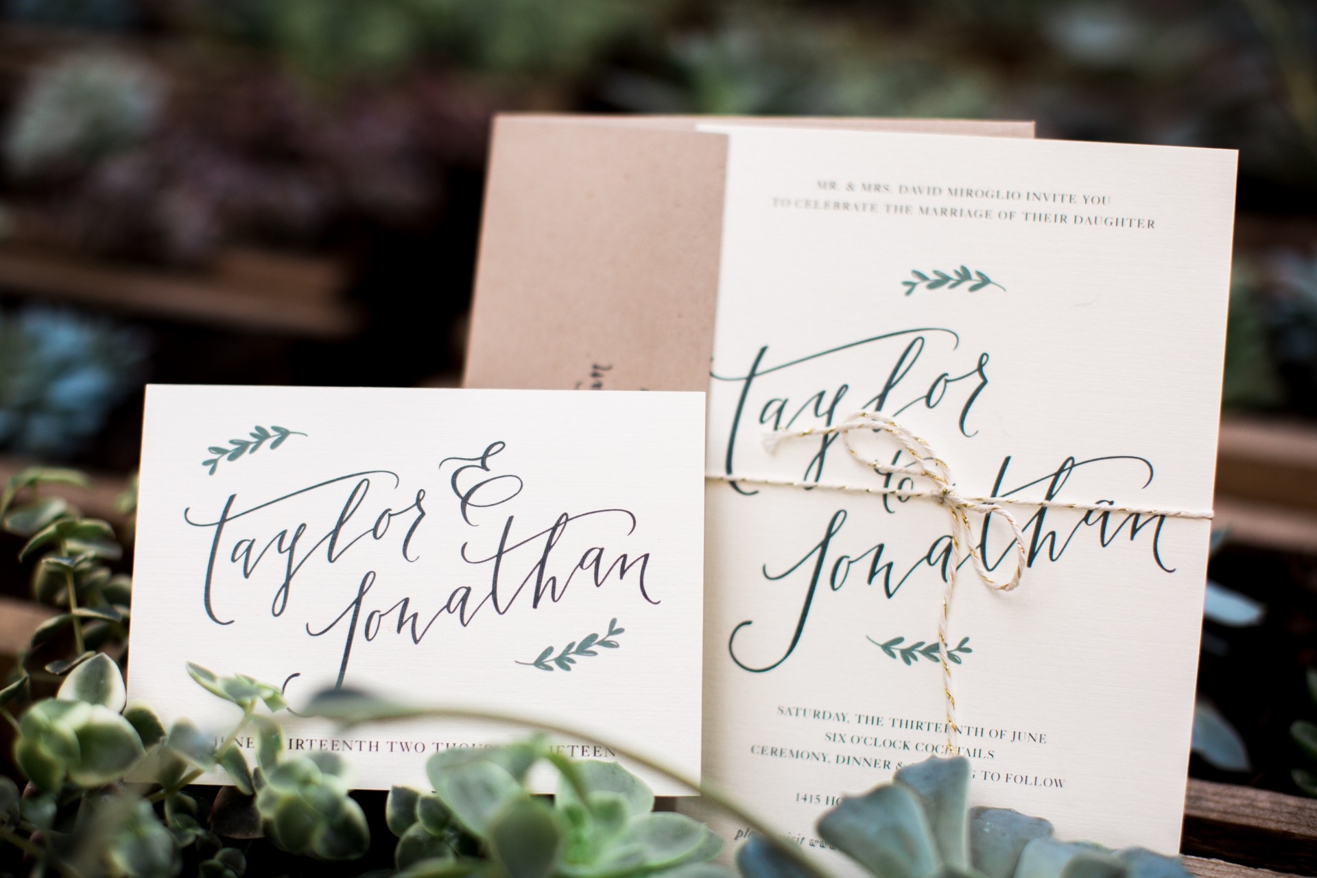
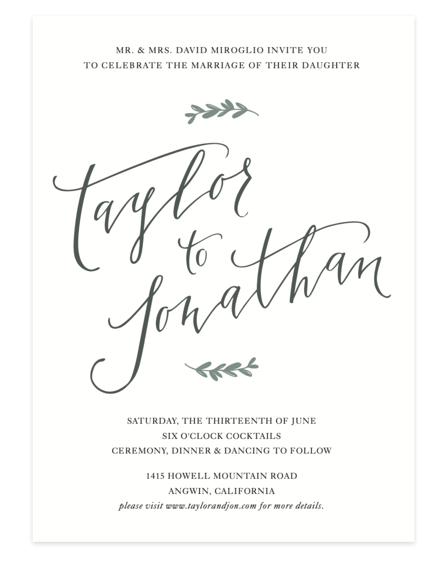
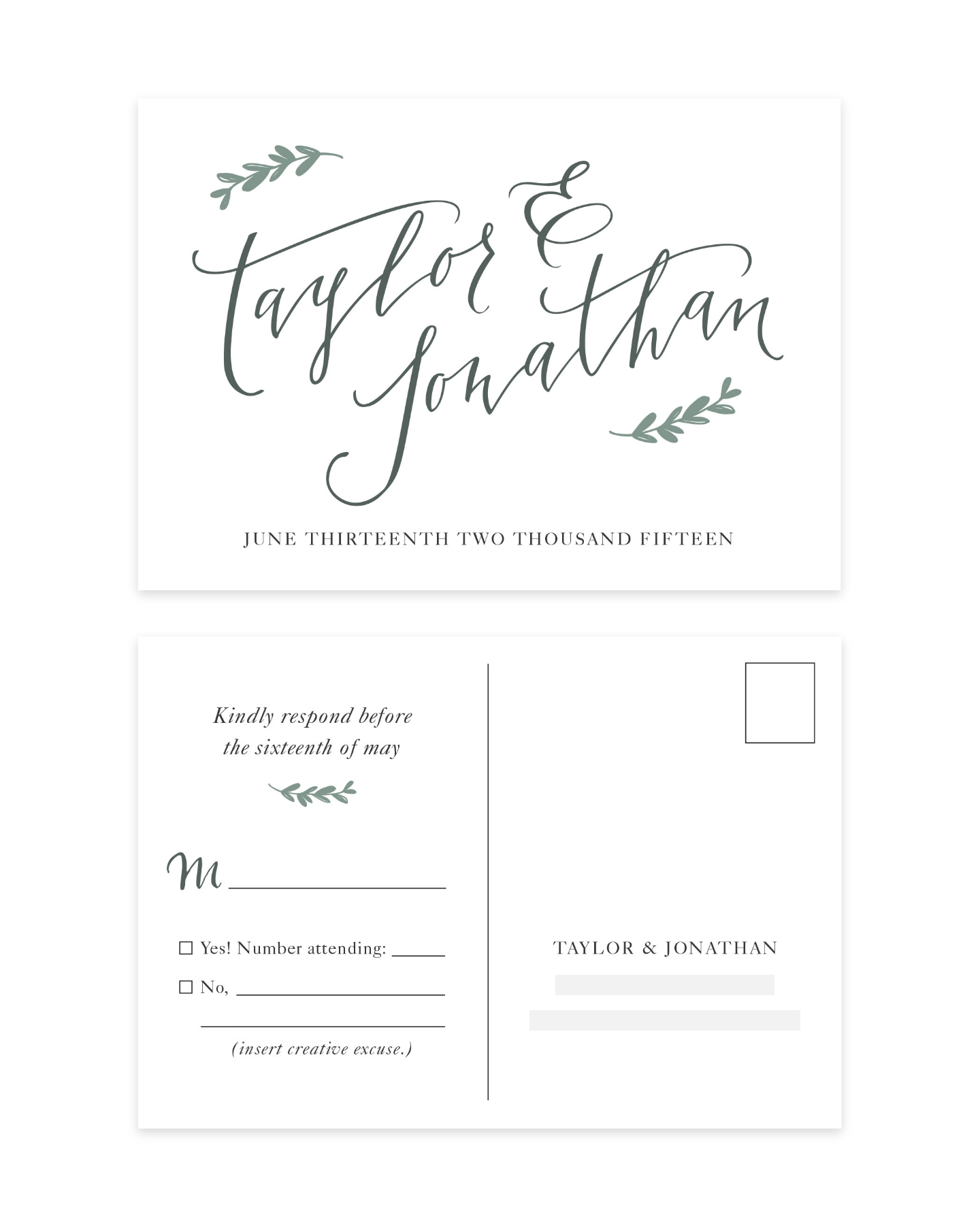
Taylor and Jonathan’s requested something elegant and simple for their modern boho wedding. We opted for a design where their names were the star of the suite, which I wrote using dip pen calligraphy, scanned, and traced over in illustrator to create the smooth modern curves. The leaves framing the lettering, paired with classy Garamond.
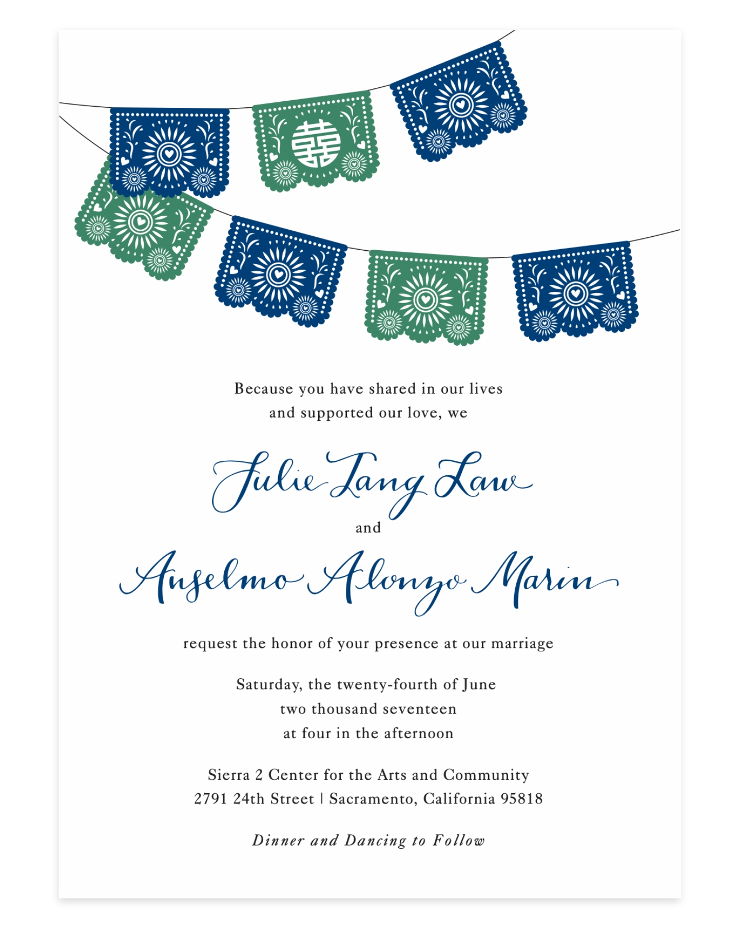
Julie & Anselmo
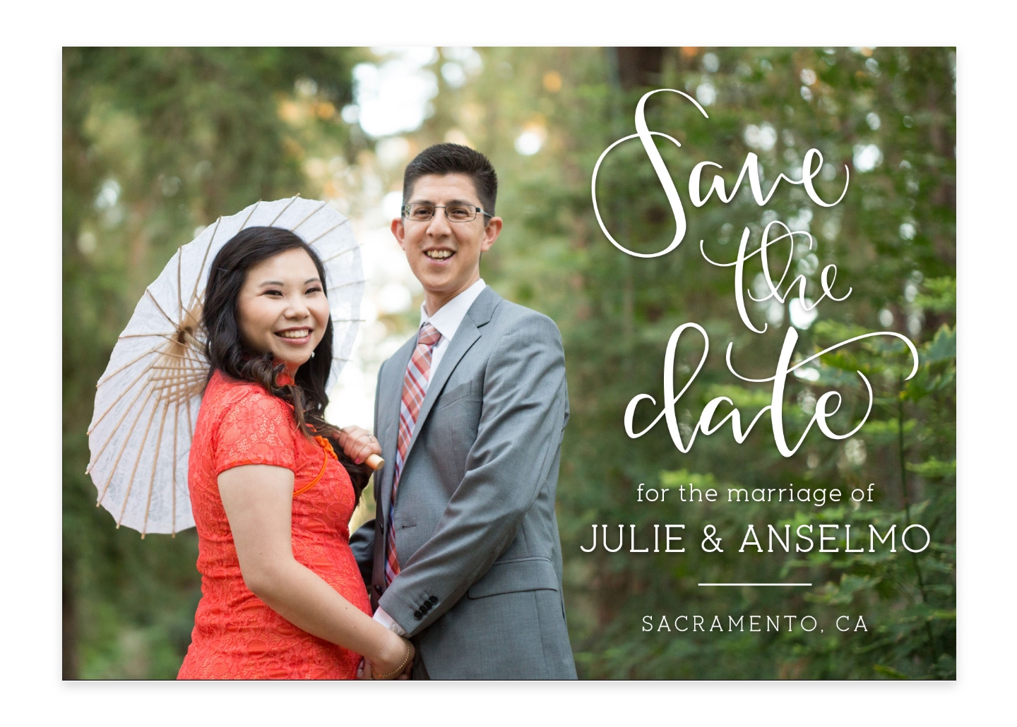
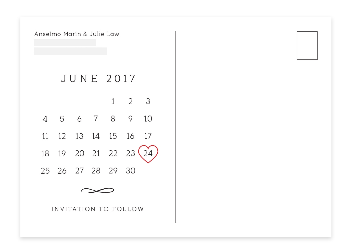
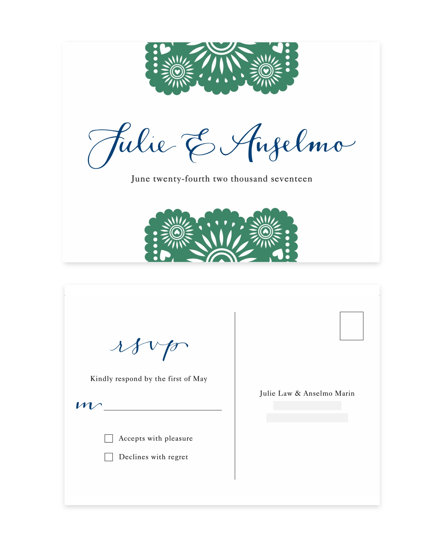
Julie & Anselmo envisioned an invitation that would combine both of their cultures. The bride requested I combine the Mexican papel picado and the Chinese double happiness glyph. Using the double happiness symbol as a cutout in one of the papel picados felt like the perfect seamless way to merry the two. Their save the date was designed as a seperate postcard, with the intention of being more casual and living on their guests fridge. It was a fun opportunity to be more playful with typography and hand lettering.
Kaela & Gilbert
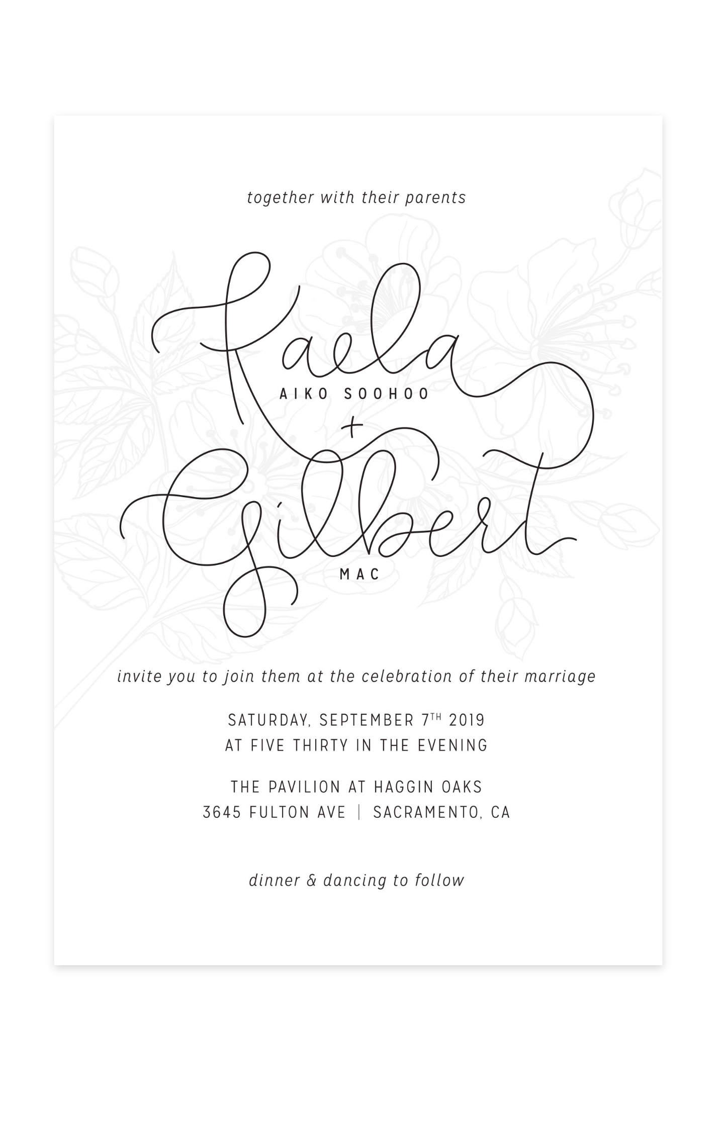
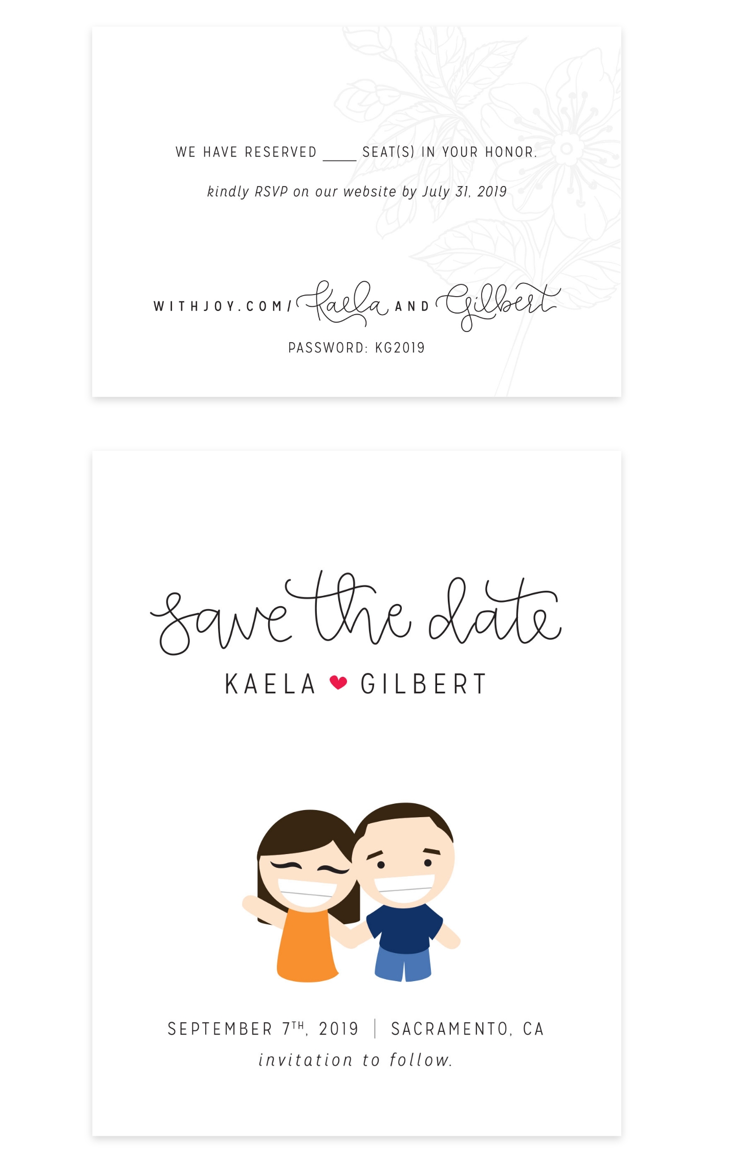
I chose to keep my invitation with a simple black and white, but make it feel special by incorporating hand lettering and floral embellishments . The floral illustration in the back was blind embossed on the finished product. Our names written out in a simple single lined stroke paired with a narrow san serif font to keep it modern and elegant. It wouldn’t be a Kaela project without a cartoon, the save the date felt like the perfect casual place to incorporate a fun illustration of my husband and I.
