Gap CTA Style Guide
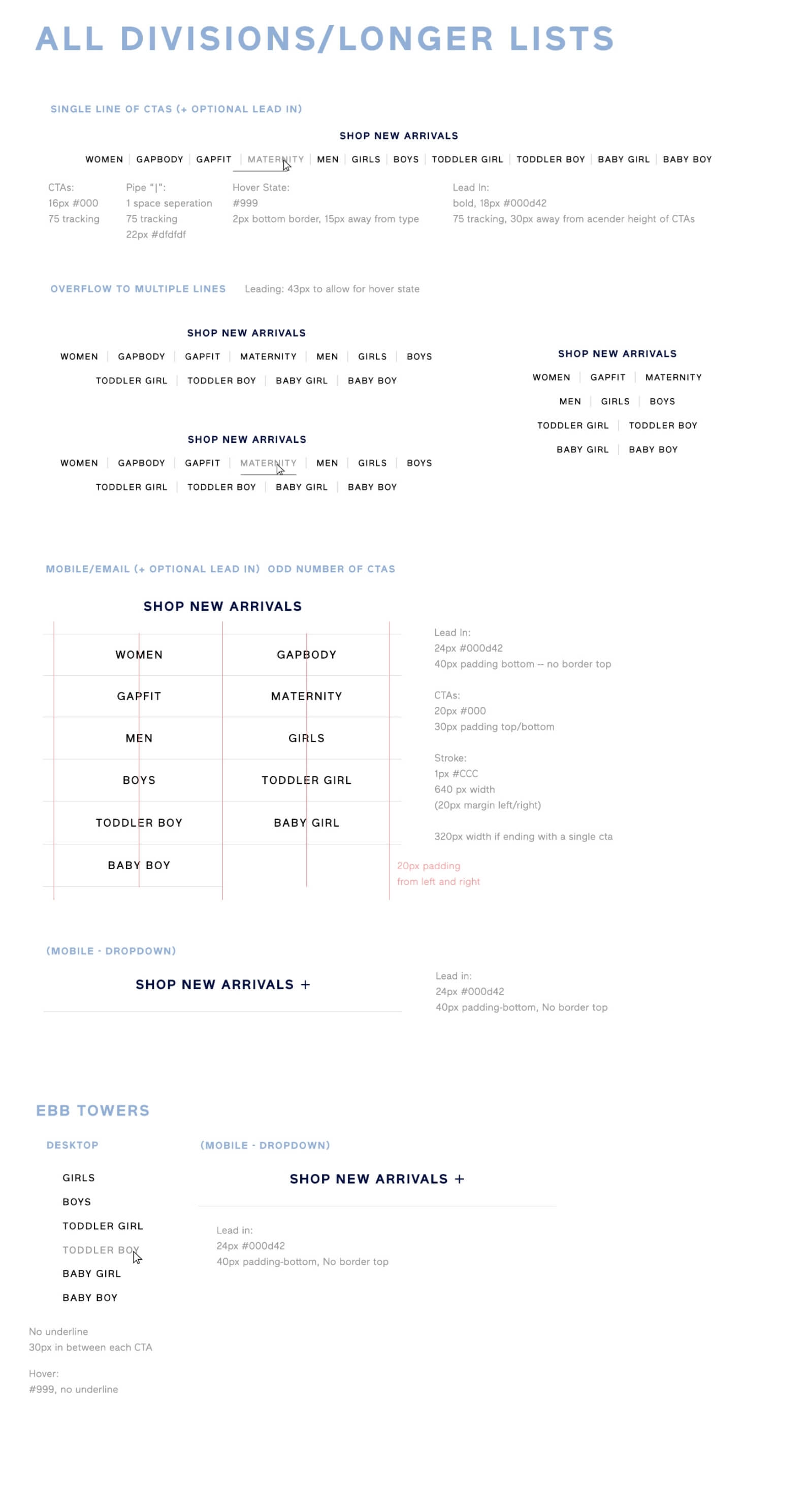
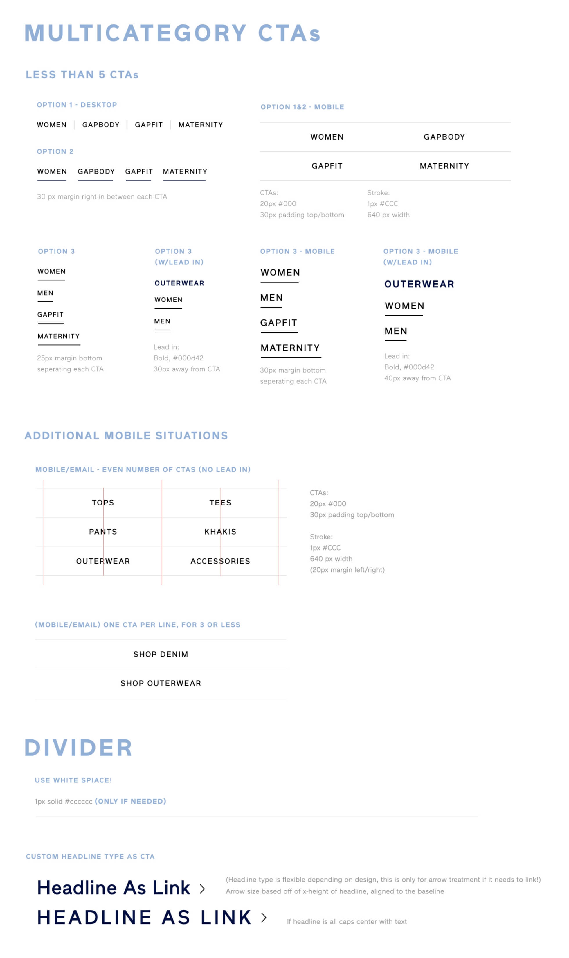
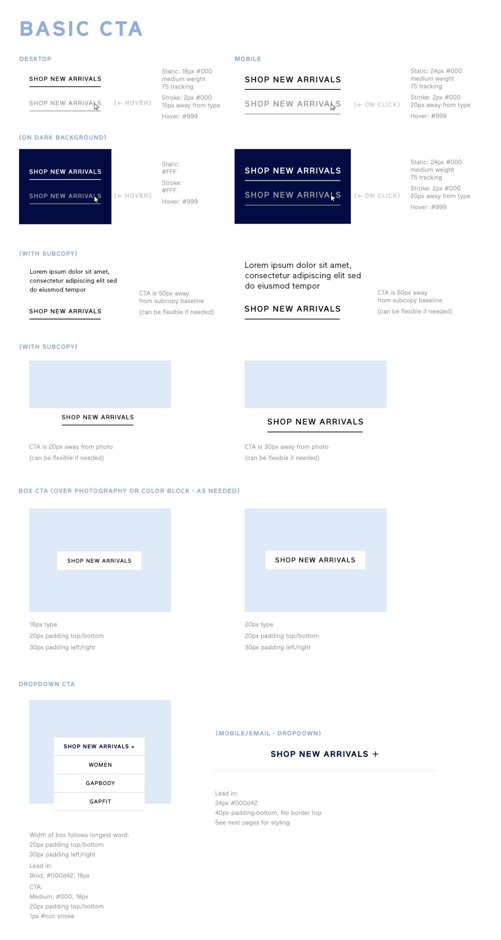
The “Call To Action” is hands down one of the most important elements on any website. At Gap.com, it gets our customer to where they need to get to, even more importantly -- to the product we want them to purchase. This is one of the many style guides I developed to encompass our CTA library for all instances of CTAs across the website.
The Challenge
- Create an all encompassing CTA design library that can be used across all design teams (Merch, Promo, Factory, UX).
- Design a clean, elevated solution for all use cases that will align with Gap’s brand identity.
- Follow best practices for size, legibility, and prominence -- all while maintaining brand integrity.
- Encourage the user to CLICK!
- Creative should be able to live for a long period of time.
My Role
- To design and build the CTA Library for Gap.com and email marketing.
- To lead a pod of 3 designers from different teams who shared the common passion of wanting to create a better CTA system.

Process
- In the first pod meeting I hosted we discussed the following questions: “what do we want to improve?” and “what works/does not work well on our current site?”
- Together we brought back inspiration and compared competitors to discussed what we liked and felt could work for gap.com, while addressing the answers we discussed in our first meeting.
- Followed up with each of us putting together mockups of what we envisioned the system to be, then met to discuss how we could bring the best of our work together to create a cohesive system.
- After we met I took away everyone’s creative and put together our final draft of the CTA Library to present to leadership.
What came next?
- This was the first time we took a deep dive into CTAs, to gather all instances from all teams, clean up and create a cohesive design system and would set us up for success as future iterations were to be developed.
- I created a PSD library so each of these pieces were pixel perfect and easy for our designers to access as needed to ensure consistency.
- This became one of the many seasonal libraries that I created during my tenure ar gap. We continued to find places to improve as we gathered new data from testing and results. The look and feel was also adjusted as each seasonal creative direction changed.
