Gap CMS Design System
In 2021 Gap began the transition to a Content Management System (CMS). This would allow production team members to quickly build content for the website and make fast updates without the need for code. The website was to be made up of several “content types” that could be easily populated with imagery and copy with creative dictated by our Style Guide.
My Role
- Lead representative for the digital creative team during this transition.
- Provide design direction for all content type templates and style guidelines.
- To create the Design System for the future of gap.com with CMS.
- Sharing and implementing the new design process to design into CMS with the design team and creating design libraries for use. Provide group and individual training to the design team as needed ot ensure a smooth transition.
Duration
- Jan 2021 - Ongoing
Considerations
Each content type should be an evergreen template that must be flexible yet consistent enough to be low touch and live for a long period of time. Below are questions I had to consider as I finalized the template for each one.
- What is the purpose of each content type?
- What parts of the content type does the creator need to be able to control?
- What content can remain the same across all assets? What parts should be dynamically styled text vs customizeable type?
- How much flexibility should be given to the person creating this page? How can we reduce inconsistencies and design errors from the person building it, but also allow for some creative freedom for the design team?
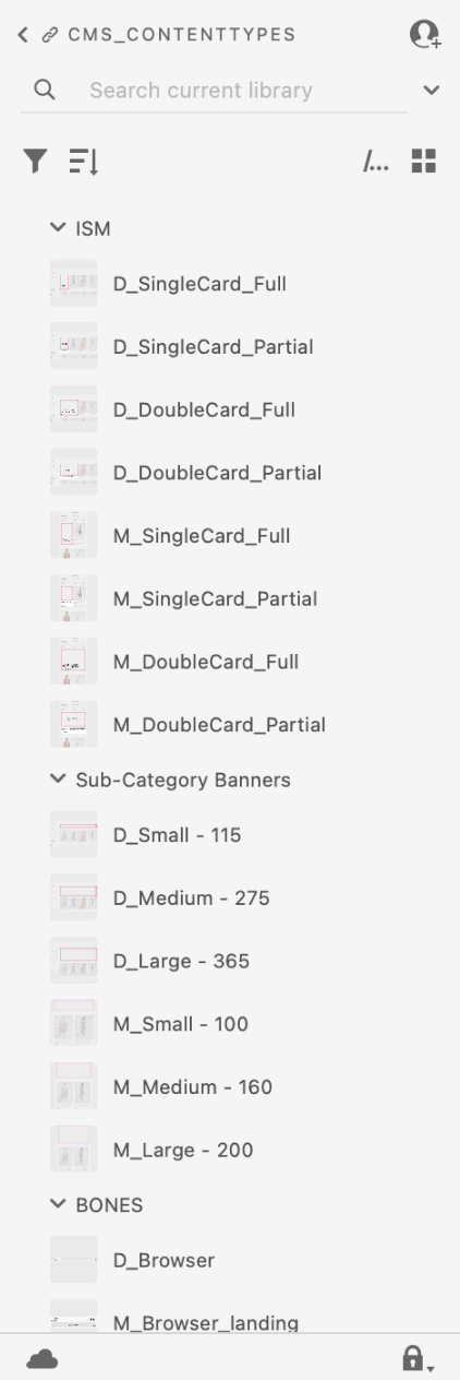
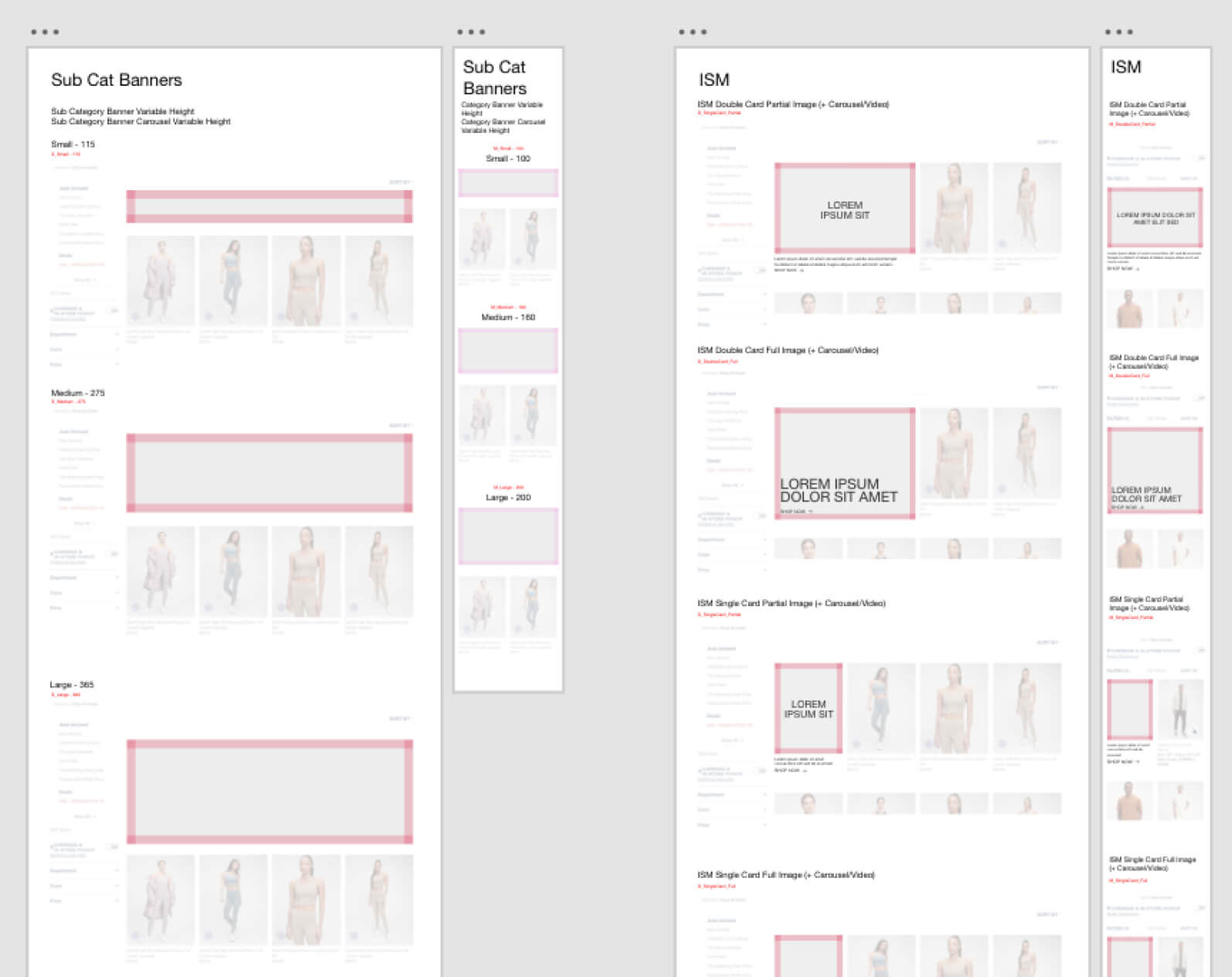
Category Page Design Library Components
Research
Because these content types were intended to live for a long period of time, each piece was thoughtfully created with the resources below:
- Close partnership with Audience Experience, Marketing, and the UX team to obtain a better understanding of best practices on the website and share results from past experiences that have been successful.
- Ensure accessibility standards are always met. (Font sizes, color contrast, user control)
- Proposed A/B testing for experiences we were uncertain of how to move forward.
Takeaways
- Height specifications for banners based on screen size and to sat within the boundaries of the “fold”.
- For content types with slideshows, it is recommended to have no more than 3 slides for user engagement.
- Font sizes to meet hierarchy and accessibility needs.
- Icon navigation (see below).
- Desktop Test A: Large clear icon presentation with CTAs below each image.
- Desktop Test B: More subtle, elevated inline approach with smaller icons.
- Mobile Test A: Icon navigation in the form of a carousel. Allows content to be above the fold.
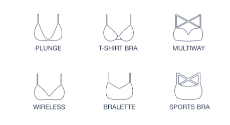
- Mobile Test B: Exposed icon navigation, takes up more space resulting in product lower down the page.
a/b testing - icon navigation
The Tee Shop and Bra shop were some of the most popular cataegories on gap.com, both of which utilized icon navigation to help the customer visualize fit. How this was to be presented became an ongoing debate between creative and marketing. To aid our decision making, we conducted an A/B test. The duration of this test would live for 3 months on our website. Below are the different versions I designed to be included:
Test A (Desktop)
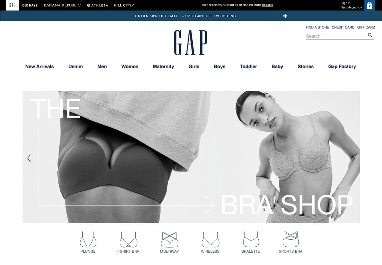
Test B (Desktop)

Test A (Mobile)
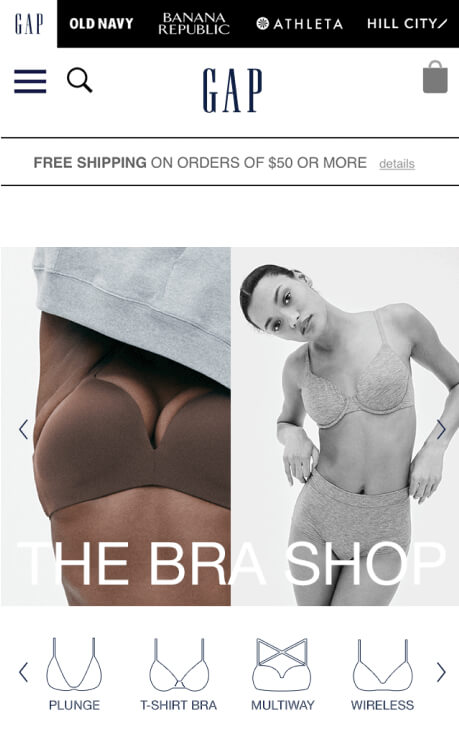
Test B (Mobile)
- For desktop both results performed equally, there was not a clear out performer. The customer engaged well with both and was able to navigate to where they needed. The design preference was to move forward with test B because of its clean more elevated execution.
- On mobile the exposed navigation was the clear winner. The categories that were not exposed saw much less engagement on test A. therefore the customer had a harder time seeing the product they wanted to despite product being higher above the fold. We moved forward with exposed icon navigation, test B.
Results
Style Guide
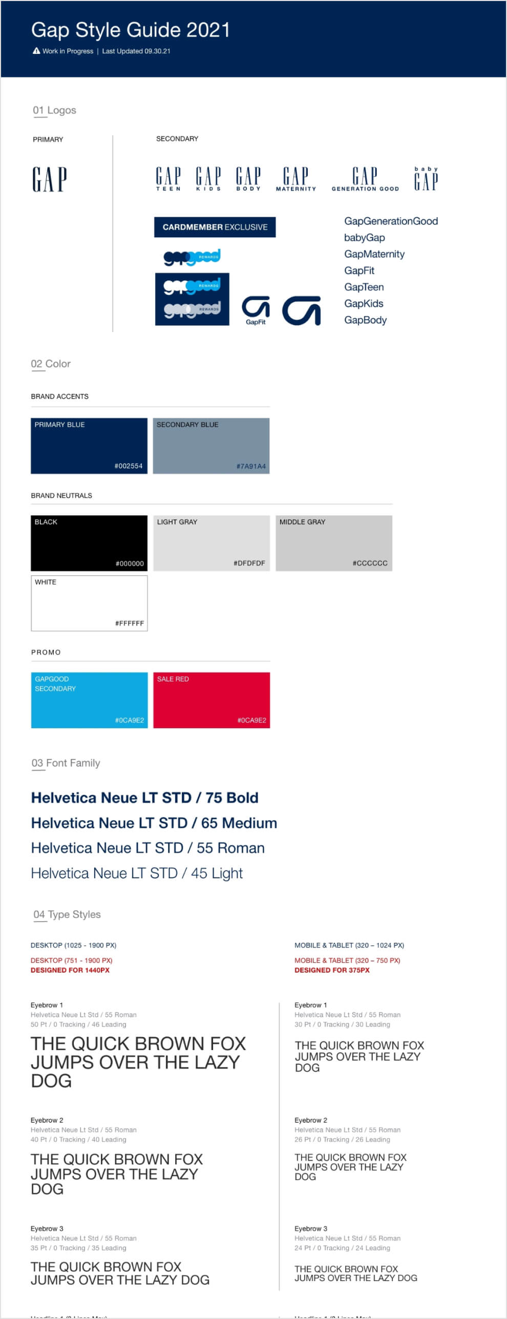
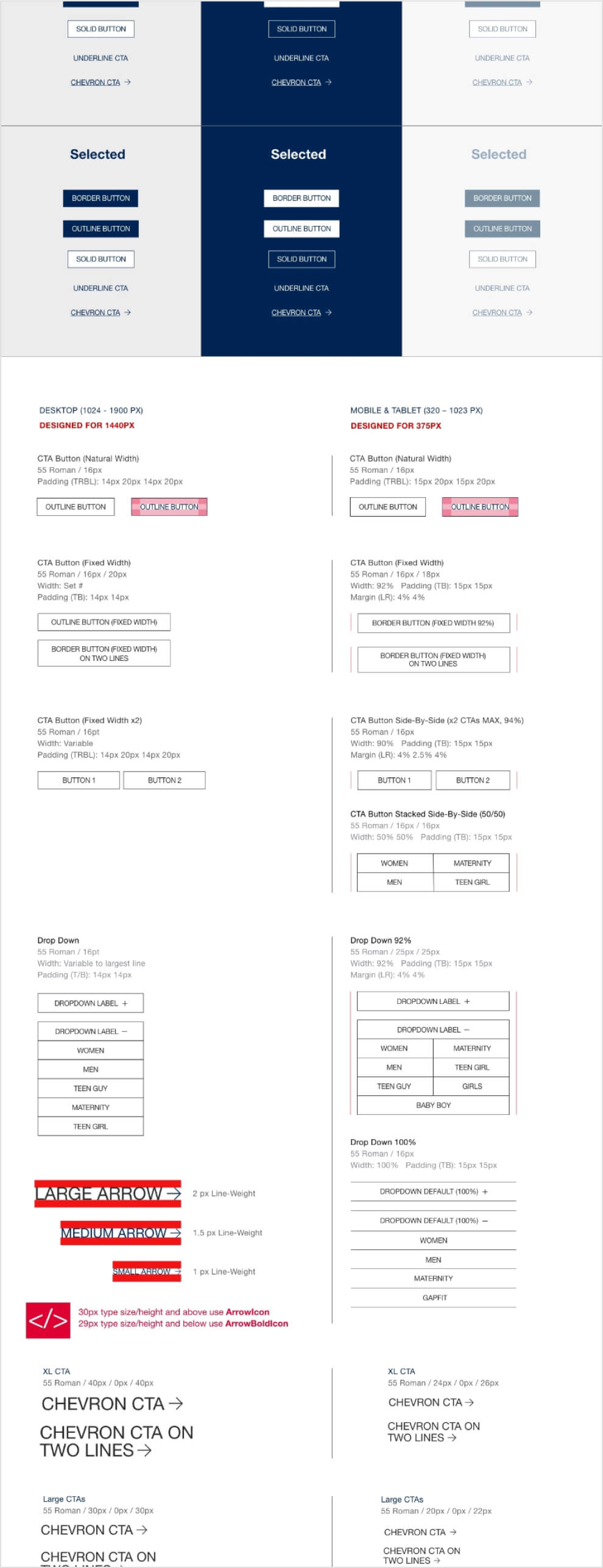
Each content type referenced styles from the library I landed with the Bouteous UI designer. This library included the following information: logos, colors, fonts, type sizes, CTAs, buttons and icons. Below is a small snapshot of what was finalized.
